



So the big yellow M doesn’t stand for Mac after all
Who would ever have thought that the good, familiar yellow M doesn’t stand for McDonald’s? Yes, really—the Mac’s logo actually stands for two breasts.

The beginning
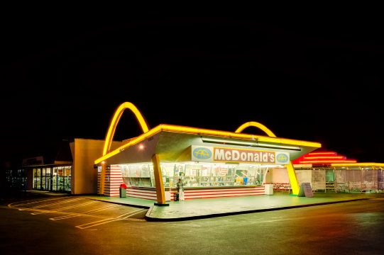
Before the two big yellow arches became the logo, they were part of the restaurant. In the past, you mainly recognized the Mac by its buildings, which had a yellow arch on both sides. During the 1960s, these had to make way for the drive-through. Fortunately, a psychologist managed to convince the chain not to eliminate the arches completely, but to incorporate them into the logo.
The new logo
At the time of the renovation, it was still perfectly normal for mothers in the family to take care of dinner by default, so the Mac’s slogan was also “Give mom a night off”. A designer suggested that the arches could represent the breasts of the ‘McDonald’s mothers’. This logo ultimately stuck, and fortunately, these days we associate the arches with hamburgers and French fries.
Read also:


