



Pardon? Is there a sexual explanation behind the McDonald’s logo?
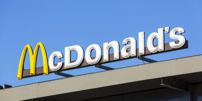
To me, that golden-yellow M, which I can recognize from far away, stands for many things. Happiness, satisfying hunger, followed inevitably by a McStomachache, of course the Big Mac, and childhood memories such as the euphoria of being allowed to have a Happy Meal. And it stands for many more things. But if there’s one thing I don’t associate it with, it’s anything sexual. Yet according to Eric Schlosser, that is exactly the case.

He is the author of the book Fast Food Nation: The Dark Side of the All-American Meal, in which he described what he believes to be the sexual background of this yellow M.
We almost didn’t have this logo
According to Schlosser, the two founders of McDonald’s wanted to get rid of the logo in the 1960s, but were persuaded not to. Louis Cheskin, their design consultant, advised them against it. Not because it was already such a recognizable logo at the time, no… And not because it was very clearly just an M standing for McDonald’s.
Nope, Cheskin saw the success of that yellow M through a Freudian lens. More specifically: he thought the yellow M of the Maccie resembled the two breasts of a nurturing mother. Seriously.
‘At McDonald’s, you feel at home’
Visitors would supposedly see it that way unconsciously too, and as a result the entire M would become associated with a feeling of home and hunger — which would make customers keep coming back to McDonald’s. If I’m being completely honest, I have never once associated that yellow M with anything like that… But if that’s really the case: it certainly works. I always feel very much at home at McDonald’s.
Also read:


