


Food stories
10 times it turns out making a sign isn’t so easy
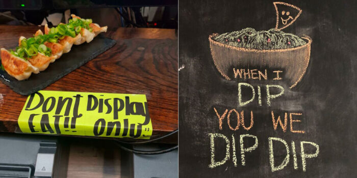
A note on the window, a poster on the counter or a sign in the garden: you’ve really done your best, and yet it’s turned out horribly wrong. These 10 examples clearly show that making a sign isn’t as easy as it seems.

door Sabina Posthumus
When you see these disasters, you can’t help but look for explanations. Are there people who read from top to bottom rather than from left to right? Yes, perhaps in Asia. But all these posters come from the United States. Well, graphic design simply isn’t for everyone, as this clearly proves.
-
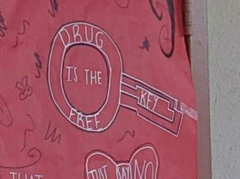
- Er is iets gratis, geloof ik?
-
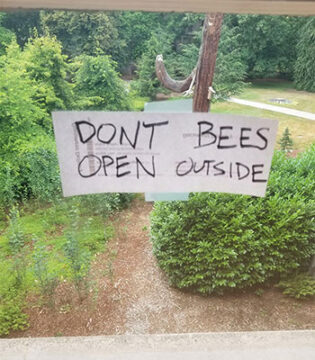

- Nee bijen, niet doen!
-
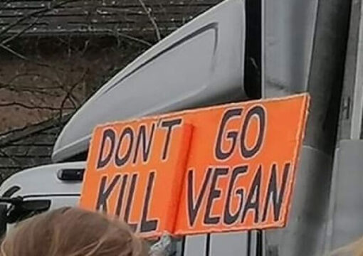

- Veganisten vermoorden is niet veganistisch.
-
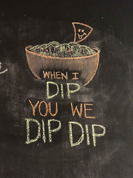

- Dip dip, is dat de beruchte dubbeldip?
-
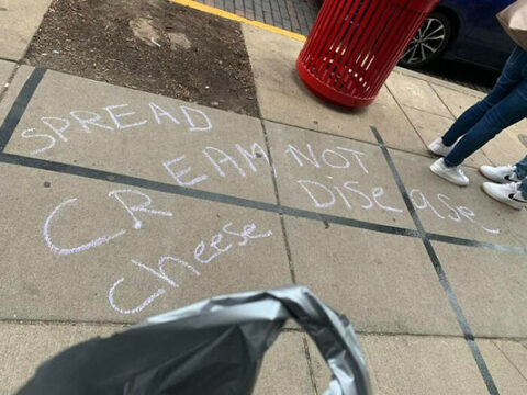

- Kaas en vrede en kaasziekten.
-
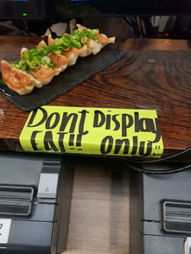
- Niet eten? Wel eten? Wat moet je laten zien?
-
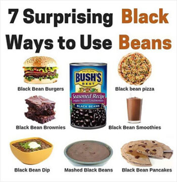

- Dat wist je niet over bonen.
-
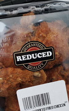

- Korting op de kwaliteit.
-
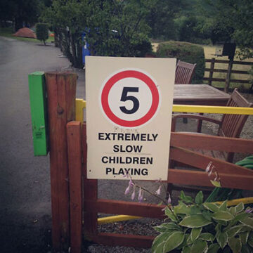

- Hele langzame kinderen spelen hier.
-
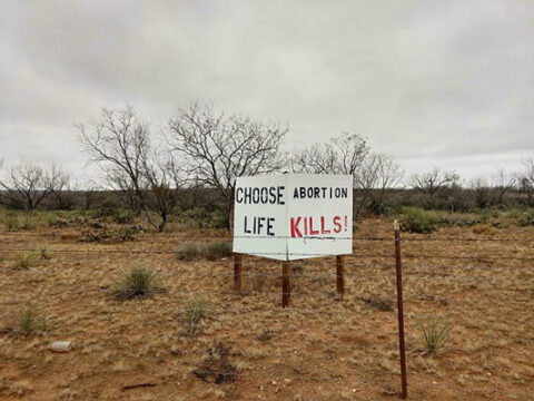
- Niet wat je bedoelde, maar wel duidelijk.
Sad humor
Quite a lot goes wrong. Earlier, we saw menus with humor on the level of ‘pull my finger’, and menus translated by Google Translate, or by a well-meaning passerby.
Also read:
- This is how a dog on your plate can actually be great
- 5x what you’re doing wrong when baking and how to fix it
- These plates for children have turned out slightly wrong
Source: Bored Panda


